Overview
The Activity Timeline shows you when your visitors use your website. Instead of just seeing totals, you can identify temporal patterns: which hours bring the most traffic, which day of the week is the strongest and how activity is distributed between weekdays and weekends. This helps with concrete decisions: when to publish content, when to send newsletters, when to schedule maintenance windows or when your support team should be available.Finding the Dashboard
The Activity Timeline is located under User Behavior → Activity Timeline in the sidebar. The page is always available and does not require any additional configuration.Time Range and Filters
Use the toolbar at the top to select the analysis period: 24h, 7d, Last 30 Days or 90d. Alternatively you can define a custom date range using the date picker. The arrow buttons let you navigate forward or backward step by step. The Conversion Filter on the right lets you narrow the view to sessions that include a specific conversion event. This way you see not just when visitors arrive, but when they convert.Dashboard Components
KPI Cards
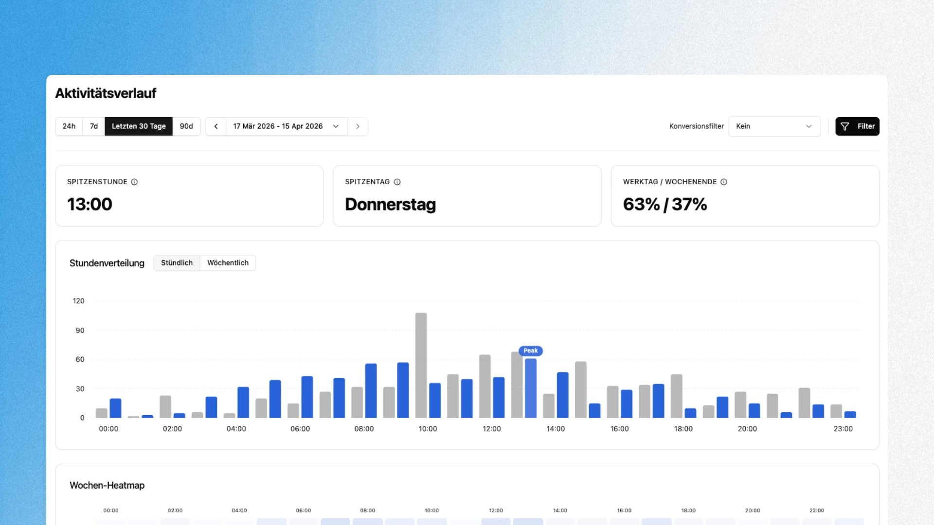
The three cards at the top surface the key metrics at a glance:Hourly Distribution / Weekly Distribution
The bar chart in the middle has two views that you can switch between using the Hourly and Weekly tabs. Hourly shows the visitor distribution across the 24 hours of a day. Each hour has two bars: the current period (blue) and the previous comparison period (gray). The bar with the highest value is marked with a Peak label. Weekly shows the distribution across the seven days of the week in the same two-bar format. This lets you see at a glance whether usage patterns have shifted compared to the previous month or week.Weekly Heatmap
The heatmap at the bottom combines both dimensions: days of the week (vertical) and hours of the day (horizontal). The darker a cell, the more traffic falls into that time slot. This lets you spot hotspots like “Thursday 1:00 PM” or quiet phases like “Sunday morning” without having to read individual numbers.Typical Analyses
Optimize content timing Publish blog posts, social media content or newsletters at times when your audience is actually active. The hourly distribution shows you the window with the highest reach. Evaluate weekday vs. weekend A high weekend share (e.g. 40%+) suggests a B2C audience. If the weekday share is 80% or more, you are likely looking at a B2B profile. The distribution helps you tailor content and campaigns to the right usage pattern. Plan maintenance windows The heatmap reliably shows you the quietest time slots of the week. Schedule deployments, migrations or maintenance work during these phases to affect as few users as possible. Identify conversion times Use the conversion filter to show only sessions with a conversion. If your traffic peak is at 10:00 AM but your conversions happen at 2:00 PM, you know that users need time to make a decision.Combine the Activity Timeline with User Groups to analyze peak times for different audiences separately. B2B visitors often have completely different timing than organic blog traffic.