Overview
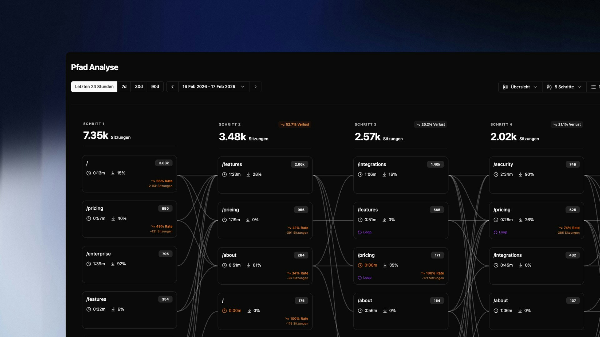
Path Analysis visualizes the most common navigation routes of your visitors as a Sankey diagram. Each column represents one interaction step – from the entry page to several clicks deep into the session. The connecting lines between columns show how visitors flow from one page to the next. At a glance you can see: where users enter, which paths lead to conversion, and where sessions drop off.Reading the Diagram
Each box in a column represents a page and shows three metrics:| Metric | Meaning |
|---|---|
| Number top right | Number of sessions that reached this page at this step |
| Clock icon | Average time spent on this page |
| Arrow icon | Bounce rate for this page |
A Loop label on a page means visitors returned to it multiple times within the same session – a signal of either disorientation or active re-engagement with important content.
Controls & Views
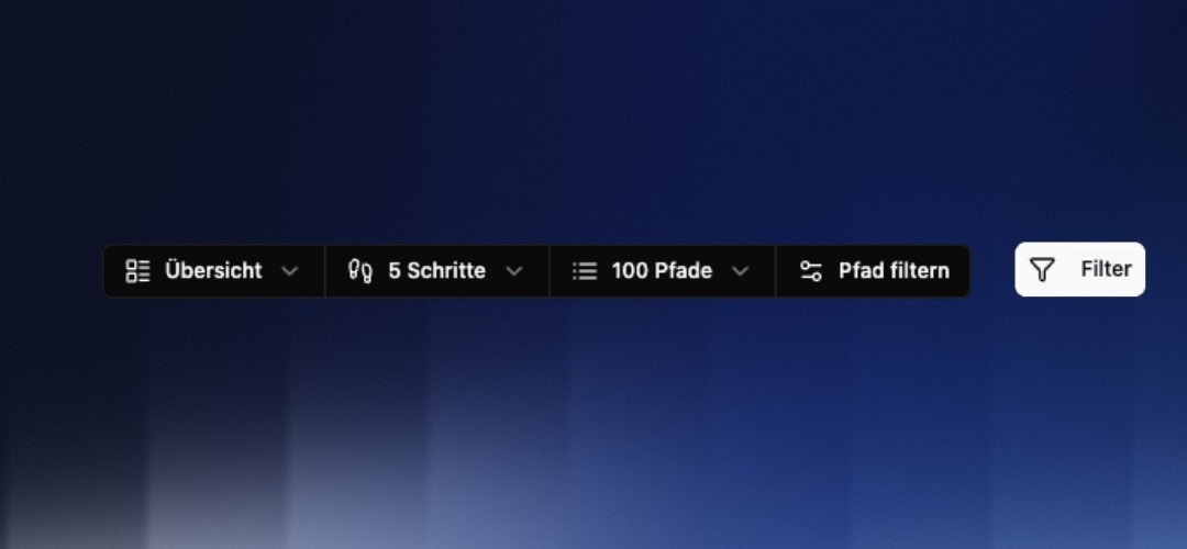
- Overview — All paths in the standard display
- Losses — Highlights pages with high drop-off rates (shown in orange)
- Loops — Shows only pages that users return to multiple times (shown in purple)
- Start point — e.g.
/pricingto see only paths that begin on the pricing page - Target page — e.g.
/checkoutto work backwards and see which routes lead to checkout
Expanding Grouped Pages
When a column contains many low-traffic pages, they are combined into a “X more pages…” box. Click Details to expand the full list and see all grouped URLs with their session counts. Individual URLs can be unpinned directly from the group – they’ll then appear as their own box in the diagram.Events in the Path
Path Analysis now shows events visually right in the path – such as outbound link clicks. This way you see not only which pages visitors move through, but also where in the journey an event is triggered and how often. Clicking a step opens the event details with the associated target URLs and their frequency. At a glance you can tell at which point in the journey users click an external link, for example – and how often.Saved Journeys
A configured path analysis (start and end point, depth, view mode) can be stored as a saved journey and recalled later with a single click. This means you don’t have to rebuild recurring analyses – such as your most important conversion path – from scratch every time.Common Analyses
Finding drop-off points A high loss between two steps shows where sessions end. Is the transition unclear? Is a call-to-action missing? Combine the Losses view with a filter to directly address the affected pages. Reconstructing conversion paths Set your checkout or thank-you page as the target in Path Configuration. The diagram will show you in reverse which routes users actually take to convert. Understanding loop behavior Loops on navigation pages (e.g./) are a warning sign – users aren’t finding what they’re looking for. Loops on content pages can be positive, indicating high relevance.
Combine Path Analysis with User Groups to view conversion paths of transactional users in isolation.